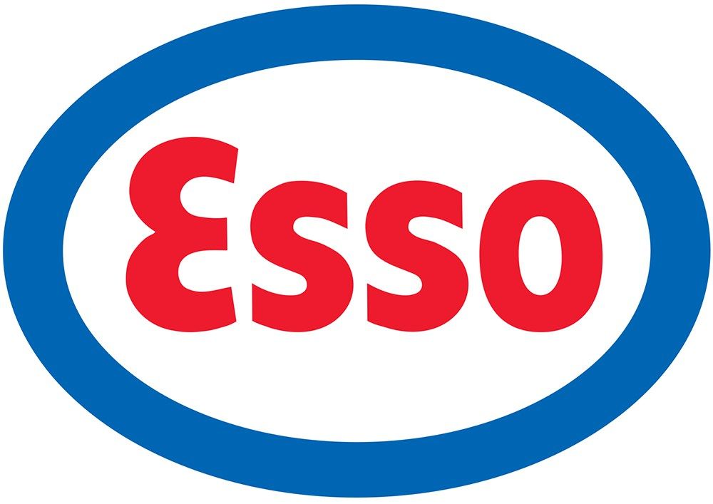
ID: F026 DATE: 1933
TITLE: Esso CLIENT: Standard Oil Co. of New Jersey, US
DESIGNER: Unknown CATEGORY: Logo
Esso (also known as ExxonMobil) stands for Eastern States Standard Oil, although since it’s founding in 1912 the brand has spread allover the world. By the 1960s, Esso began spending millions on their branding yet they retained their simplistic brand identity. Their colours were taken from the American flag to show they are an American company. The logo is fairly similar to other brands such as ford due to its oval shape and handwritten font. The designer of the original logo is unknown, and the first design has changed very little since it was designed. Between 1926 and 1933 the logo was made up of loose handwritten font in blue within a red circular border. Since then the logo has evolved to become more modern. The letters are now straight and simple, making them easy to read and easily identifiable. The font colour and the border colour have been swapped so the border is now blue and the font is now red. The brand identity of the American colours still stands however. The outline circle has been made thicker so it stands out more.
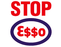
In the early 2000s Greenpeace altered the logo, replacing the two ‘s’s with dollar signs. They were campaigning for people to boycott Esso and their related parent company’s brands. Esso France took Greenpeace to court over this, stating that Greenpeace were associating them with the Nazi Secret Service. They lost their case as the courts believed it was within Greenpeace’s freedom of speech rights.
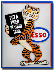
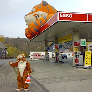
At one point Esso chose to use a tiger in their advertising as it symbolised both power and play, two things they believed the consumer desired most when it came to driving. This evolved into a series of advertisements on both television and radio with a tiger theme. In Germany, you could see giant inflatable tigers on top of petrol stations. They also had people in tiger mascots costumes outside their stations. Ad campaigns on billboards etc often consisted of the tiger mascots alongside the tag line “Put a tiger in your tank!” as tigers are associated with speed. This tag line was used all over the world with Germany using the phrase “Pack der tiger in der tank!”. They once ran a campaign where they had an advertising executive suggest getting rid of the tiger, they followed this with a series of ads campaigning to save the tiger. They even had petrol pumps at stations that were covered in tiger stripes.
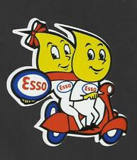
Esso fuel also briefly had a mascot that looked like an oil drip. He was called ‘Drop boy’ and featured in campaigns during the 1950s. Cartoon mascots were very popular at this time. He often went alongside the catchphrase “Happy Motoring!”. He was designed by a Danish designer named Vilhem Hansen. Merchandise can still be found of this mascot in many forms such as keyrings. Drop boy has a girlfriend too, who can be seen in this award winning animation: https://vimeo.com/10149605?cjevent=4a0e6551e91511e8829700d10a180510Marc Altshuler’s Logorama is comprised hundreds of iconic brand names, logos and mascots including Esso.
Esso’s branding is quintessentially American, down to it’s colours and advertising style of using mascots. They have a clear brand that embodies their American roots and have not changed much over the years as it continues to be a successful business.
References: https://fueloilnews.co.uk/2015/04/new-look-for-esso-brand/
https://www.esso.ca/en/our-history
https://www.exxonmobil.co.uk/en-gb/company/about-us/uk-history/esso
