By Emily Ellis
Shell is the most well-known and recognised oil company worldwide. Its branding is very simple, memorable and iconic which is what makes it so interesting. It was initially created in 1907 and was the result of a merger between Shell transport and trading company and Royal Dutch Petroleum Company. As the two companies had plenty of experience in this area, they formed a large and successful brand that has grown and progressed over time.The company is currently owned by Ben van Beurden and in 2017 its revenue was 305.1 billion USD which shows the extent of its success. Its branding and logo has stayed reasonably consistent which shows that it is a timeless design that is clearly successful. In fact, Shell has changed their logo 10 times but very subtly over time.
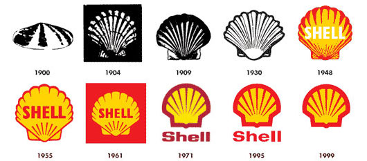
The thing I noticed most about the shell logo is that its evolution of styles and decades is very strong and clear. The shapes become simpler and less realistic as the logo become more modern. The first logo design was actually black and white and had little detail to it. Up until 1930 the logo looked pretty similar; however, in 1948 colour was added to it and a bold sans serif font was added on to the shell design. The use of warm colours, yellow and orange, makes the logo stand out as warm colours advance in front of cool colours. It is believes that the colours initially took inspiration from the spanish flag as shell first built petrol stations in California which was previously a Spanish colony. The sans serif font also gives the logo more clarity and a sense of identity. At the time it would have appeared very modern as serif fonts would have been used before this. The text is in white which contrast with the red however, is slightly unclear against the yellow. This could explain the change in 1955 where the text was made red. This time the shapes became more defined and modern.Sticking to the use of only 2 colours makes the logo stand out more and appear simpler. As the logo has stayed consistent over the years, a strong identity has been created which again contributes to them being so successful as people recognise a brand as being good quality. In 2061, the logo was again adapted and a red background was added. This made the design appear slightly boxier.The shape of the shell remained similar from the previous design which meant that the change was again subtle and did not confuse customers. The only issue with having the red box background is that if it is applied on a surface, which is not red, it can look quite unprofessional. This might suggest why in 1971 they decided to take out the red background and change it to a design similar to the 1955 one.
In recent years, shell have had their most minimalistic designs to date with no text, two colours used and sharp shapes. Shell has focused on advertising and connecting with customers a lot throughout their history. Their style of branding through posters, their website and adverts comes across as quite industrial, simple and practical. They target a wide variety of people so their adverts are diverse and simply state facts and information
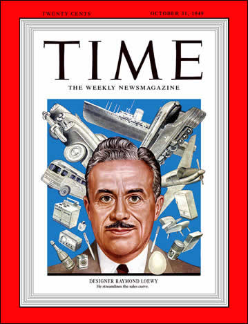
The logo from 1971 was designed by a French industrial designer, called Raymond Loewy, and is still used to this day. Raymond Loewy is recognised for many designs; some of his clients include BP, Coca-Cola, Exxon and Lucky Strike. His designs are very influential and he has even been featured on the front of Time magazine in Oct. 31, 1949. During World War 1 Loewy served for the French army and was wounded there. This prompted him to then move to New York in 1919 where he worked as a window designer in department stores and a fashion illustrator. After this he then began doing work as an industrial designer. Loewy has worked on some very large projects for the Pennsylvania Railroad such as passenger locomotives, stations,passenger-car interiors, and advertising materials. He has done a wide variety of creative pieces which shows of his different skills and innovative ideas.
All in all, Shells Logo design has not developed that much considering it has be around for so long. The general concept of the design has remained the same and is very simple but effective. It is very memorable due to the fact that only two colours are uses and the shapes are simple. Shell has clearly decided to stick with their original logo design as it is already working and is creating a strong brand identity.
References
https://en.wikipedia.org/wiki/Royal_Dutch_Shell
