Sophia Slater
Andy Warhol was an American illustrator and Graphic designer, best known for his work in the pop art era. His silkscreen paintings of Marilyn Monroe and Campbell’s soup cans are internationally recognised and made Andy Warhol a household name. Before Warhol got his big break, he was a working illustrator with his first magazine appearance in an issue of Glamour in 1949. Later going on to work for companies such as Tiffany & Co., Columbia Records and Vogue.
Although his interiors cover launched in the mid 1950s, Warhol had been developing his technique long before. His early style of line drawing, (commonly known as the blotted line technique), was introduced to Warhol when he was still a student at the Carnegie Institute of Technology. Warhol would blot two papers together to create a fractured, fragile line as seen on the interiors cover. This allowed him to produce more sketches in a short time and would give his clients more options, therefore increasing his work income. This proved to be a refreshing contrast from the clashing colour and thick lined propaganda of that time. This line technique created consistency in Warhol’s work, helping to define him as an illustrator and create a recognisable style.
The 1950s brought a selection of new art to the scene as the world was still recovering from the devastation of the second world war. Politics was a key influence on contemporary art. Influence from the 1940s overflowed into the next decade and art was used to influence politics as can be seen from war propaganda posters. Resources for modern art were minimal which caused the increased popularity of affordable techniques like collage and Warhol’s favourite; silkscreen print.
Warhols designs all carry the same recognisable dotted line technique but as time progressed so did his style. His first cover, from May 1951, features a blotted line antique clock as the subject matter, details of the clock are roughly depicted and the whole image has a ‘worn out’ impression. The background is a faded brown-pink and further looks like decayed paper, probably as a nod to the old antique subject. Unlike covers today, this one is rather minimal with the use of colour and subject matter. There is a lack of gaudy colours that many mainstream magazines had at that time. The ink drawing at a first glance is detailed, but not overly impressive as the lack of colour palette on the cover gives an unfinished feel to the overall design. Rather than a beautifully rendered illustration, this line drawing looks more like a sketch on the back of a newspaper. I think Warhol did this to relate to the down to earth readers of the magazine and get the subject point across without over complicating the design. Overall, this clock cover has a very aged and timeless ambiance.
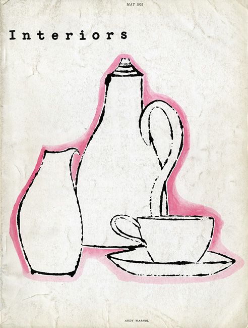
His second cover takes on a more contemporary approach to common household items. Unlike the first cover, Warhol has been very generous with white space which creates a more sophisticated design. The typical blotted line has been outlines with pink watercolour which highlights the design and creates depth in the illustration. This is my least favourite of the three covers, as I think the lack of colour and detail makes the overall design look boring and unoriginal.
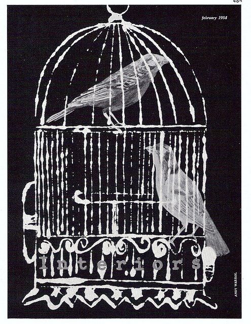
For the 1954 cover, Warhol took a different approach to his usual all hand drawn style. The blotted line overlays the cropped bird photographs creating an illusion of depth and more modern version of the dated drawings. I think the all monochrome colour scheme creates a very dramatic and melancholy mood. Warhol used bird photos showing a side profile which makes the creatures look very trapped and afraid. The all black background contrasts with the previous covers, possibly indicating a turning point in the magazines overall image and target market. The purple typography in my opinion is not the best placed. The placement near the bottom makes it hard to interpret against the white blotted lines and it’s placement amongst the bird cage takes away the significance of the illustration. I think it would have been better for Warhol to dedicate a section of white space to Interiors title. The best scenario would have been to place Interiors at the top of the design to maintain consistency across the brand based on previous issues.
Comparing the interiors covers to Marilyn Monroe, arguably Warhol’s best work, the two designs are almost unrecognisable as being produced by the same man. More than 10 years between the two works, Marilyn Monroe was created in 1967 and uses a new technique; screen printing. The blaring colours were created by layering ink and letting the colours bleed over. What strikes me about this piece, is the uncanny resemblance to Marilyn Monroe herself, whereas the interiors covers although realistic, were a lot more sketched and stylised. The pop art culture was booming in the 1960s and took inspiration from modern icons and comic book styles. Marilyn Monroe is a prime example of this era with the design to me being reminiscent of an explosion in a highlighter factory. This work is significant as Warhol has an excellent tendency to pick up on modern world trends; whether that be antiques and collectables from Interiors in 1951 or the beloved movie star Marilyn Monroe in 1967.
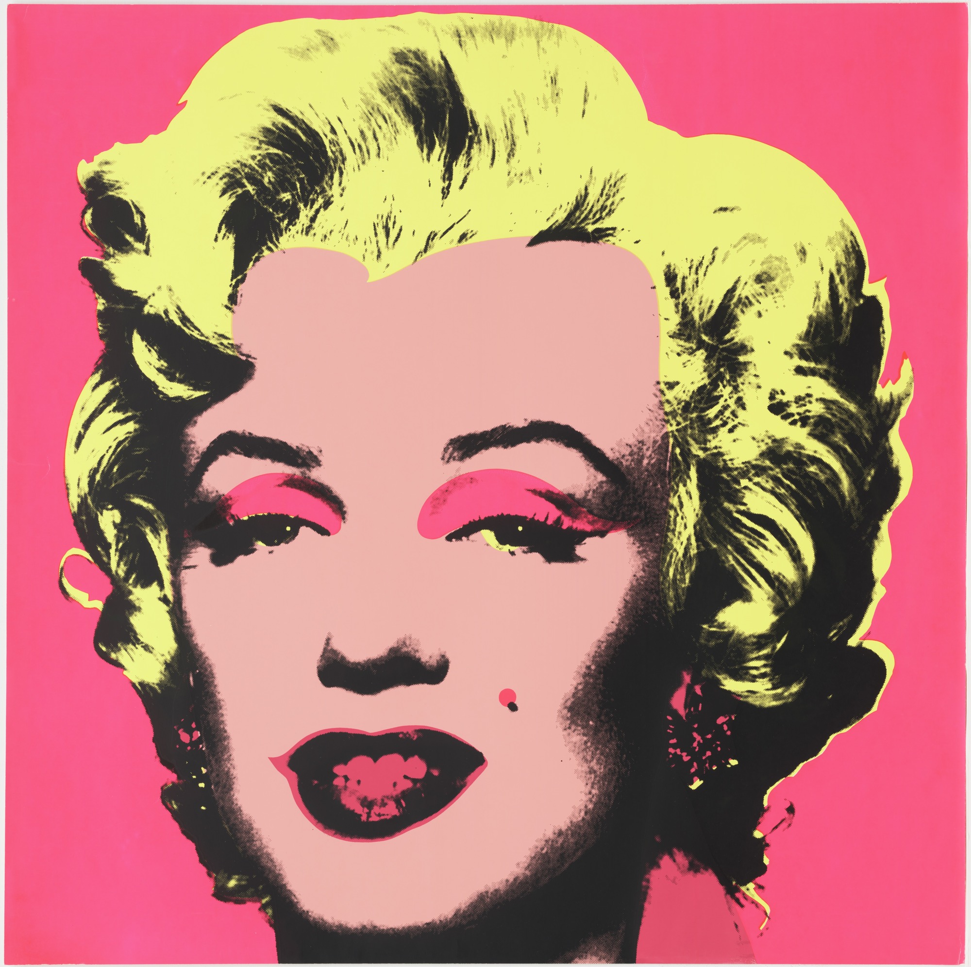
Even though Marilyn Monroe is a much more beloved piece in the art world, I personally prefer the minimalistic style of Interiors. I think this is because Warhol was still finding his feet as an artist and had not yet been exposed to the 1960s trends. The technique of blotted line makes his work much more raw and authentic, appealing to his audience of young artistic minds. At the time of his first cover in 1951, magazine covers were flourishing with glamour models and high fashion. Warhols work in the 50s brought back the simple technique of pen drawing with his own flare which made it appropriate for that time.
References:
https://en.wikipedia.org/wiki/Andy_Warhol
https://www.warhol.org/andy-warhols-life/
https://www.widewalls.ch/1950s-art/
https://revolverwarholgallery.com/andy-warhol-screenprints-process-history/
https://www.moma.org/collection/works/61240
https://www.ducksters.com/history/art/pop_art.php
