Sophia Slater
Shigeo Fukada was an unknown designer to me, but his impact on the creative world was monumental. Fukada is a Tokyo born designer, whose work would later gain popularity in New York. This poster is an advertisement for an exhibition of Fukuda’s work for a department store in Japan.
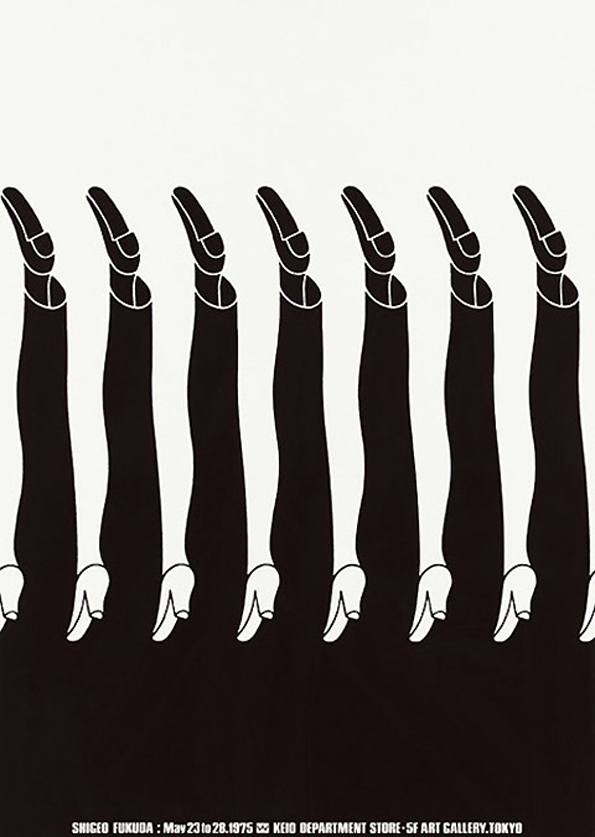
Something that really caught my attention was Fukuda’s quote from Idea magazine, “I believe that in design, 30 percent dignity, 20 percent beauty and 50 percent absurdity are necessary”. That applies to this poster indefinitely as the male-female legs intertwining are absurd indeed, but there is something quite quirky and intriguing. It suggests Fukuda wanted to break the design barriers of that time and challenge our views on equality and unity between the two sexes.
This design appealed to me as the black and white colour scheme had a lot of impact and put emphasis on the repeated pattern. This design reminds me of the yin and yang symbol, purely because of the colour choice and the interweave of two shapes. It is possible Fukada drew inspiration from this Chinese phycology as the symbol originates from 3rd century BCE. I think Fukuda wanted the viewer to determine the meaning themselves, as the text at the base of the design is completely useless at providing justification. To me, the design looks like a group of male and females whereas to others they might see only one person with each of their legs a different sex. At a first glance, I see a woman dominating a man, purely because the white catches my eye and is positioned in the upper half of the composition. When I stare at the design for too long I notice my eyes straining, is this because Fukada wanted to make the design deliberately uncomfortable to prove a point about inequality? Or is this a side product of the optical illusion?
It comes as no surprise to me that this poster, which displays a fight between the sexes, was designed in 1975 and shares the same era as a peak in feminism. The feminist movement progressed rapidly in the late 1970s, and fought for equality rather than dominance. This links directly to the poster which equally shares the composition in the harsh contrast of black and white.
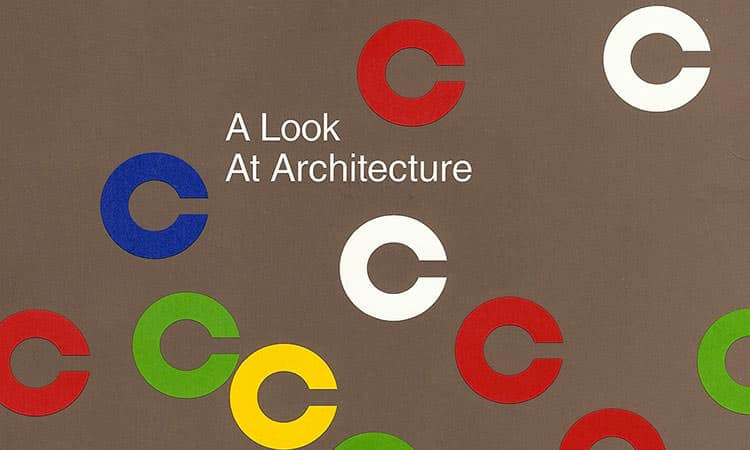
In his teenage years, Fukuda was introduced to Swiss Graphic design, a style of design that soared in the 1950s. The style was found in Germany, Netherlands and other European places but grew popularity in Switzerland. The style featured asymmetric layouts as well as grid structure and sans serif typeface. Paul Rand, one of the most famous graphic designers of the world, brought the Swiss style to America in 1970s. His 1974 cover ‘A look at Architecture’ puts the Swiss style to use. The crowded layout and sans serif type is typical of this trend. I think the minimal colour scheme is reminiscent of Fukuda also as well as the warm tones. The cover also uses Fukuda’s typical repetition which gives the design a quality of movement as well as capturing the eye of the public.
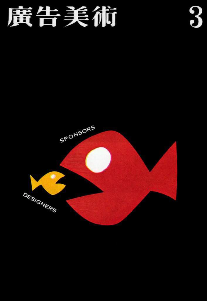
Furthermore, Fukuda also drew inspiration from Takashi Kohno, a trending graphic designer in Japan near that time. My favourite work of his is from a 1960 magazine cover and shows a sponsors fish about to eat a much smaller designers fish. This plays on realism and connects to real world issues, two things that can be observed from Fukuda’s work. Similar to Fukuda, Kohno uses striking shapes and high contrast to give his designs maximum impact. Both designers rely on a strong idea rather than intricate and perfect outcomes. The minimal text is also a similar component of both posters as it puts more emphasis on the imagery and encourages the viewers to find their own meaning.
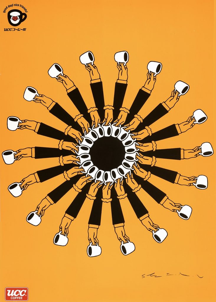
On researching Fukuda, I found this design for UCC Coffee from 1985, notably 10 years after his Kieo department store poster. This poster obviously follows a spiral composition and the circular repetition gives the impression of a wheel drawing you in. Similar to the legs, the arm holding coffee appears to overlap each other or, arguably, be the same arm. After an initial glance, I noticed Fukuda has put a black circle surrounded by a white ring in the very centre as the focal point. From a birds eye view, this looks like looking down on a coffee cup. Again, Fukuda has left the poster with mixed interpretation. This poster seems less political, the yellow colour scheme suggesting a relaxed and upbeat mood, possibly implying the joy of drinking a cup of coffee. The spiral teamed with the yellow could be interpreted as the sunshine, which links to the advert as coffee is usually drank in the morning. Or could be a sunflower with the arms becoming petals. Whatever Fukuda had in mind, the advert is clearly successful as the spiral composition is very powerful in capturing the viewer’s attention and encouraging them to look further. Compared to the Keio piece, this one has more depth and detail, your eyes are lead towards the centre rather than horizontally. I personally prefer the Keio poster as it had deeper meaning with inequality whereas UCC was intended to boost sales of coffee.
Overall I think the poster is successful at fulfilling its function, which was to catch the attention of viewers to encourage them to visit an exhibition of Fukuda’s work. Even to the non-designer eye, the poster still evokes interest and defies the norms of trends in the 70s. If I was to offer an improvement, I think it would be interesting to see what the poster would look like with different shoes. This could add interest to the design and maybe intrigue the viewer further, however could lose the optical illusion effect. Looking at other work by Fukuda, his trademark style seems to be taking one or more shape or outlines and repeating them consistently. While others describe his work as ‘deception’ I think it relies on simplicity and not over complicating a concept. There is no right or wrong meaning behind this design, as everyone will process it a different way, encouraging conversation and further selling the designer’s work.
References:
http://adcglobal.org/hall-of-fame/shigeo-fukuda/
http://www.designishistory.com/1960/shigeo-fukuda/
https://en.wikipedia.org/wiki/Push_Pin_Studios
https://galeriemichael.com/2018/01/analyzing-periods-of-contemporary-art-the-1970s/
https://en.wikipedia.org/wiki/International_Typographic_Style
