Vanity Fair, Mehemed Fehmy Agha

Sophia Slater 

Mehemed Fehmy Agha rose to the spotlight when he travelled from Berlin to America to become the new art director for Vogue magazine. The publisher, Conde Nast, had chosen Agha to be the new art editor in three of the most famous magazines of that time; Vogue, Vanity Fair and House and Garden.  

The year 1930 was one of great uncertainty for America. The stock market crash in 1929 meant over 15 million Americans had no source of income. This was a global disaster and many felt there was no solution in sight. This was around the time Agha took over Conde Nast productions and Vanity Fair. The magazine was understandably not selling well at this point, which drove Agha to make some revolutionary design changes to excite the readers again. 

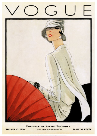
During the 1930’s, Art Deco had a huge influence on the early covers. This style was funded in France and made its way to New York featuring geometric shapes and bold contrasting colours. With the development of sky scrapers and architecture came new metallic surfaces and more dulled down colours. This is evident in the 1930 cover as the crisp cut outlines and faded colours create a geometric effect.  

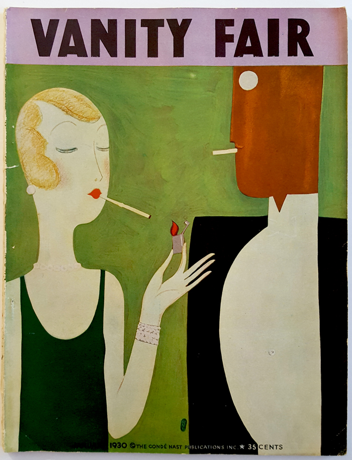
The January Vanity fair cover in 1930 is one of Agha’s earliest works for the company. The illustration by Eduardo Garcia Benito, shows a woman lighting a cigarette for her male partner. The green cover gives a freshness and relaxed mood to the viewer, possibly as an ode to the new year. Compared to his later works this one is more tame of Agha’s designs, the colour scheme and subject matter are more comfortable. The sans serif text at the top (a staple of Vanity Fair’s typography) catches the viewers eye in it’s heavy font. To me, this cover looks more like a cigarette advertisement than a high fashion cover. The colours are very subdued which dulls down any excitement of the reader. Although, the crisp lines and block shapes are very modern and unique for that  time period. 

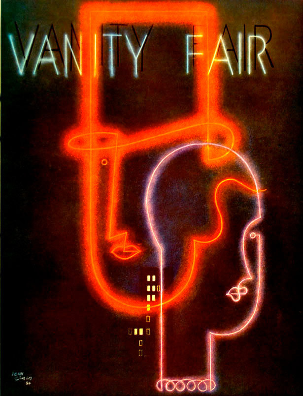
In 1931, Jean Carlu, a French graphic designer, created the April cover. Carlu is known for his cubist inspired art, particularly patriotic posters. What drew me to this piece was the high level of sophistication in the design. The 1929 font heavy ‘Vanity Fair’ is replaced with a skinny neon effect font with drop shadow. This gives the illusion that the text is glowing in the dark. The image appears to be a man and woman face overlapping, with simplistic features that give it a contemporary twist. Compared to Agha’s 1929 design this style is a lot more dramatic and intense, like a New York street night. 

Not only did Agha reinvent Vanity Fair covers, but he also paved the way for graphic designers to use techniques we use to this day. Through his work with Vogue, he introduced the first ever double page spread along with photos continuing over the edge, otherwise called bleed. These techniques gave the magazine a new lease of life as well as capturing the viewer’s interest. The Double page spread leads the eye seamlessly across with no sense of guidelines. Overall, this makes the magazine more easy to read and navigate through large volumes of text and accompanying pictures. Also noticeable, is the generous use of white space. This puts emphasis on the surrounding text and images and makes the article more inviting to read altogether. There is no crammed feeling with previous, older issues and Agha has really thought out how relaxed he wants the readers to feel.   

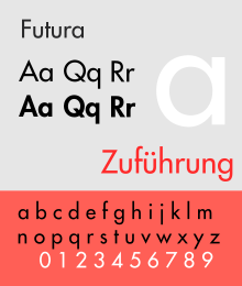
When Agha took over Conde Nast publications he disapproved of the magazines traditional, outdated style. He traded the italics for Sans Serif fonts like Futura in order to appeal to the young, impressionable audience. This heavy font fits with the magazine’s slick, classy brand image as well as being easy to interpret articles quickly. It ties in nicely with Agha’s simplistic trademark style as the font letters are the bare minimum but still timeless and crisp.

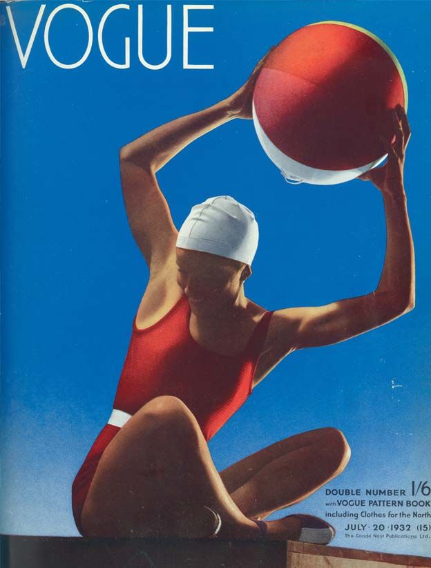
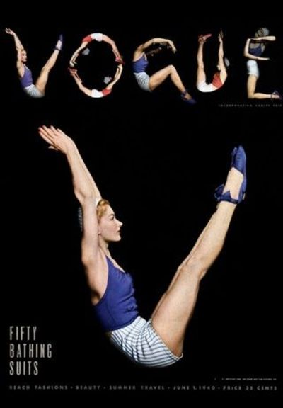
Fast forward to 1940 and Agha is still challenging and breaking the barriers of modern magazine covers. The 1940 issue ‘Fifty bathing suits’ replaced the traditional ‘VOGUE’ font with photographed women showing the letters. This cover is more couture fashion than Agha’s previous Vanity Fair issues, there is more sex appeal than the previous man and woman covers. I think this is a really unique idea that had never been done before and is reminiscent of Agha’s ability to defy previous design rules. The crisp, cropped images contrast harshly with the black background. The result is a dramatic, female empowering cover that the reader can picture themselves rocking a bathing suit. I prefer this approach to the more toned down Vanity Fair illustrations. Although conducted by the same designer, this 1940 cover has a sense of maturity and elegance through the images which is absent in Vanity Fair. This could be due to Vanity Fair being more unisex whilst Vogue’s audience was more high class women.  

In conclusion,  I think Mehemed Fehmy Agha is the dark horse of the design world. Agha was a previously unheard name to me, despite Vogue and Vanity Fair being two of the biggest global magazines in 2018, notably almost 90 years after he was editor. I think his designs are quirky and a complete refreshment compared to the mainstream photograph models we see in today’s Vanity Fair. Agha picked up on 1930s trends in his own way and made the magazine as contemporary and fun as possible. Looking deeper than the cover, it is a shame that his invention of the bleed and double page spread are so uncredited. It is these techniques that make inch thick magazines so readable and inviting to today’s screen addicted generation. 

References:

http://www.magazinedesigning.com/mehemed-fehmy-agha-first-art-director/

https://www.history.com/topics/great-depression/1930s

https://wikivisually.com/wiki/Mehemed_Fehmy_Agha

https://en.wikipedia.org/wiki/Art_Deco

Shigeo Fukuda, Keio department store poster

Sophia Slater

Shigeo Fukada was an unknown designer to me, but his impact on the creative world was monumental. Fukada is a Tokyo born designer, whose work would later gain popularity in New York. This poster is an advertisement for an exhibition of Fukuda’s work for a department store in Japan.

Something that really caught my attention was Fukuda’s quote from Idea magazine, “I believe that in design, 30 percent dignity, 20 percent beauty and 50 percent absurdity are necessary”. That applies to this poster indefinitely as the male-female legs intertwining are absurd indeed, but there is something quite quirky and intriguing. It suggests Fukuda wanted to break the design barriers of that time and challenge our views on equality and unity between the two sexes.

This design appealed to me as the black and white colour scheme had a lot of impact and put emphasis on the repeated pattern. This design reminds me of the yin and yang symbol, purely because of the colour choice and the interweave of two shapes. It is possible Fukada drew inspiration from this Chinese phycology as the symbol originates from 3rd century BCE. I think Fukuda wanted the viewer to determine the meaning themselves, as the text at the base of the design is completely useless at providing justification. To me, the design looks like a group of male and females whereas to others they might see only one person with each of their legs a different sex. At a first glance, I see a woman dominating a man, purely because the white catches my eye and is positioned in the upper half of the composition. When I stare at the design for too long I notice my eyes straining, is this because Fukada wanted to make the design deliberately uncomfortable to prove a point about inequality? Or is this a side product of the optical illusion? 

It comes as no surprise to me that this poster, which displays a fight between the sexes, was designed in 1975 and shares the same era as a peak in feminism. The feminist movement progressed rapidly in the late 1970s, and fought for equality rather than dominance. This links directly to the poster which equally shares the composition in the harsh contrast of black and white. 

In his teenage years, Fukuda was introduced to Swiss Graphic design, a style of design that soared in the 1950s. The style was found in Germany, Netherlands and other European places but grew popularity in Switzerland. The style featured asymmetric layouts as well as grid structure and sans serif typeface. Paul Rand, one of the most famous graphic designers of the world,  brought the Swiss style to America in 1970s. His 1974 cover ‘A look at Architecture’ puts the Swiss style to use. The crowded layout and sans serif type is typical of this trend. I think the minimal colour scheme is reminiscent of Fukuda also as well as the warm tones. The cover also uses Fukuda’s typical repetition which gives the design a quality of movement as well as capturing the eye of the public.

Furthermore, Fukuda also drew inspiration from Takashi Kohno, a trending graphic designer in Japan near that time. My favourite work of his is from a 1960 magazine cover and shows a sponsors fish about to eat a much smaller designers fish. This plays on realism and connects to real world issues, two things that can be observed from Fukuda’s work. Similar to Fukuda, Kohno uses striking shapes and high contrast to give his designs maximum impact. Both designers rely on a strong idea rather than intricate and perfect outcomes. The minimal text is also a similar component of both posters as it puts more emphasis on the imagery and encourages the viewers to find their own meaning. 

On researching Fukuda, I found this design for UCC Coffee from 1985, notably 10 years after his Kieo department store poster. This poster obviously follows a spiral composition and the circular repetition gives the impression of a wheel drawing you in. Similar to the legs, the arm holding coffee appears to overlap each other or, arguably, be the same arm. After an initial glance, I noticed Fukuda has put a black circle surrounded by a white ring in the very centre as the focal point. From a birds eye view, this looks like looking down on a coffee cup. Again, Fukuda has left the poster with mixed interpretation. This poster seems less political, the yellow colour scheme suggesting a relaxed and upbeat mood, possibly implying the joy of drinking a cup of coffee. The spiral teamed with the yellow could be interpreted as the sunshine, which links to the advert as coffee is usually drank in the morning. Or could be a sunflower with the arms becoming petals. Whatever Fukuda had in mind, the advert is clearly successful as the spiral composition is very powerful in capturing the viewer’s attention and encouraging them to look further. Compared to the Keio piece, this one has more depth and detail, your eyes are lead towards the centre rather than horizontally. I personally prefer the Keio poster as it had deeper meaning with inequality whereas UCC was intended to boost sales of coffee. 

Overall I think the poster is successful at fulfilling its function, which was to catch the attention of viewers to encourage them to visit an exhibition of Fukuda’s work. Even to the non-designer eye, the poster still evokes interest and defies the norms of trends in the 70s. If I was to offer an improvement, I think it would be interesting to see what the poster would look like with different shoes. This could add interest to the design and maybe intrigue the viewer further, however could lose the optical illusion effect. Looking at other work by Fukuda, his trademark style seems to be taking one or more shape or outlines and repeating them consistently. While others describe his work as ‘deception’ I think it relies on simplicity and not over complicating a concept. There is no right or wrong meaning  behind this design, as everyone will process it a different way, encouraging conversation and further selling the designer’s work. 

References: 

http://adcglobal.org/hall-of-fame/shigeo-fukuda/

http://www.designishistory.com/1960/shigeo-fukuda/

https://en.wikipedia.org/wiki/Push_Pin_Studios

https://galeriemichael.com/2018/01/analyzing-periods-of-contemporary-art-the-1970s/

https://en.wikipedia.org/wiki/International_Typographic_Style

Andy Warhol, Interiors magazine

Sophia Slater

Andy Warhol was an American illustrator and Graphic designer, best known for his work in the pop art era. His silkscreen paintings of Marilyn Monroe and Campbell’s soup cans are internationally recognised and made Andy Warhol a household name. Before Warhol got his big break, he was a working illustrator with his first magazine appearance in an issue of Glamour in 1949. Later going on to work for companies such as Tiffany & Co., Columbia Records and Vogue. 

Although his interiors cover launched in the mid 1950s, Warhol had been developing his technique long before. His early style of line drawing, (commonly known as the blotted line technique), was introduced to Warhol when he was still a student at the Carnegie Institute of Technology. Warhol would blot two papers together to create a fractured, fragile line as seen on the interiors cover. This allowed him to produce more sketches in a short time and would give his clients more options, therefore increasing his work income. This proved to be a refreshing contrast from the clashing colour and thick lined propaganda of that time. This line technique created consistency in Warhol’s work, helping to define him as an illustrator and create a recognisable style. 

The 1950s brought a selection of new art to the scene as the world was still recovering from the devastation of the second world war. Politics was a key influence on contemporary art. Influence from the 1940s overflowed into the next decade and art was used to influence politics as can be seen from war propaganda posters. Resources for modern art were minimal which caused the increased popularity of affordable techniques like collage and Warhol’s favourite; silkscreen print. 

Warhols designs all carry the same recognisable dotted line technique but as time progressed so did his style. His first cover, from May 1951, features a blotted line antique clock as the subject matter, details of the clock are roughly depicted and the whole image has a ‘worn out’ impression. The background is a faded brown-pink and further looks like decayed paper, probably as a nod to the old antique subject. Unlike covers today, this one is rather minimal with the use of colour and subject matter. There is a lack of gaudy colours that many mainstream magazines had at that time. The ink drawing at a first glance is detailed, but not overly impressive as the lack of colour palette on the cover gives an unfinished feel to the overall design. Rather than a beautifully rendered illustration, this line drawing looks more like a sketch on the back of a newspaper. I think Warhol did this to relate to the down to earth readers of the magazine and get the subject point across without over complicating the design. Overall, this clock cover has a very aged and timeless ambiance. 

His second cover takes on a more contemporary approach to common household items. Unlike the first cover, Warhol has been very generous with white space which creates a more sophisticated design. The typical blotted line has been outlines with pink watercolour which highlights the design and creates depth in the illustration. This is my least favourite of the three covers, as I think the lack of colour and detail makes the overall design look boring and unoriginal. 

For the 1954 cover, Warhol took a different approach to his usual all hand drawn style. The blotted line overlays the cropped bird photographs creating an illusion of depth and more modern version of the dated drawings. I think the all monochrome colour scheme creates a very dramatic and melancholy mood. Warhol used bird photos showing a side profile which makes the creatures look very trapped and afraid. The all black background contrasts with the previous covers, possibly indicating a turning point in the magazines overall image and target market. The purple typography in my opinion is not the best placed. The placement near the bottom makes it hard to interpret against the white blotted lines and it’s placement amongst the bird cage takes away the significance of the illustration. I think it would have been better for Warhol to dedicate a section of white space to Interiors title. The best scenario would have been to place Interiors at the top of the design to maintain consistency across the brand based on previous issues.   

Comparing the interiors covers to Marilyn Monroe, arguably Warhol’s best work, the two designs are almost unrecognisable as being produced by the same man. More than 10 years between the two works, Marilyn Monroe was created in 1967 and uses a new technique; screen printing. The blaring colours were created by layering ink and letting the colours bleed over. What strikes me about this piece, is the uncanny resemblance to Marilyn Monroe herself, whereas the interiors covers although realistic, were a lot more sketched and stylised. The pop art culture was booming in the 1960s and took inspiration from modern icons and comic book styles. Marilyn Monroe is a prime example of this era with the design to me being reminiscent of an explosion in a highlighter factory. This work is significant as Warhol has an excellent tendency to pick up on modern world trends; whether that be antiques and collectables from Interiors in 1951 or the beloved movie star Marilyn Monroe in 1967.  

Even though Marilyn Monroe is a much more beloved piece in the art world, I personally prefer the minimalistic style of Interiors. I think this is because Warhol was still finding his feet as an artist and had not yet been exposed to the 1960s trends. The technique of blotted line makes his work much more raw and authentic, appealing to his audience of young artistic minds. At the time of his first cover in 1951, magazine covers were flourishing with glamour models and high fashion. Warhols work in the 50s brought back the simple technique of pen drawing with his own flare which made it appropriate for that time. 

References: 

https://en.wikipedia.org/wiki/Andy_Warhol

https://www.warhol.org/andy-warhols-life/

https://www.widewalls.ch/1950s-art/

https://revolverwarholgallery.com/andy-warhol-screenprints-process-history/

https://www.moma.org/collection/works/61240

https://www.ducksters.com/history/art/pop_art.php


Spratt’s Pet Supplies

By Emily Ellis

American entrepreneur, James Spratt, launched the first large dog food manufacturer in London in the 1860s. It was named Spratt’s and what made the biscuits unique to others was that they were aimed at different stages in a dog’s life. He invented the ‘Dog Cake’ which originally consisted of wheatmeals, vegetables, beetroot and meat. The inspiration behind it is believed to have come from James Spratt seeing strays being fed off scraps of biscuits on the streets. The idea of, what we would now call, a dog treat was very original and new at this time which is what made it so interesting. Initially the ‘Dog Cakes’ were sold to English countrymen for their dogs but in the 1870s the company launched in America and began to grow.

Logo Design

Spratt’s logo is very inventive and memorable which is what makes it so interesting and successful. The idea is based around the shape of a dog but the name SPRATT’S is what creates the shape. The design comes across as very simple but that makes it very smart and easy to look at. No colour was used in their advertising which means that the focus is mainly on the text and shape, which are the most important messages in the logo. The design of the logo did not develop much over time as the design is so simple that it does not become old fashioned. The logo could also be applied to lots of advertising methods. Spratt’s focused a lot on advertising to promote their unique idea. As most of society would just feed their dogs left overs, Spratt’s needed to advertise in order to convince people to spend money on something they might not necessarily need. They created posters, billboards and when they broadened their products to items such as portable kennels, collars and shampoo for dogs.  They created adverts incorporating other animals into the original logo. This meant that the brand was still recognisable and developed further. They also created cigarette cards to advertise their products, which was a very unique and new method of adverting at the time.

In 1876, Spratt’s started creating dog soaps and other products to help care for their dogs, this shows that the company was expanding and taking over the market. Spratt’s products were prices from $7.00 to $8.00 in the 1890s. This is very expensive considering the general annual income of this time was $1,500. They aimed to target upper class people and would visit dogs hows to advertise their products. Another market they targeted was health conscious dog owners, therefore they would advertise their products as healthier for dogs than human left overs. Charles Crufts was hired by James Spratt in 1876 and he went on to create a very well-known dog show called Crufts Dog Show in 1891 in London. This dog show is still running and has increased in success.

Throughout the 1900s Spratt’s shipped products all over Europe and the USA and became one of the largest livestock shippers. However,in 1960 the business was bought by Spillers a British company that owned various food brands such as flour milling operations. By Spillers taking over, they were able to develop the original products and create a range of dry dog foods.However, from then on the brand name began to go downhill. In 1988 Nestle bought the company for £715 million; however, in 2008 Spratt’s was discontinued.

Originally, the idea was new and exciting which is what made it so popular. However, over time Spratt’s products have become boring and competitors have taken over. The branding of the design is still considered very smarty, witty and creative however, it was not developed or added to which makes it

References

https://en.wikipedia.org/wiki/Spratt%27s

https://www.gracesguide.co.uk/Spratt’s_Patent

https://en.wikipedia.org/wiki/Spratt%27s_Complex

https://en.wikipedia.org/wiki/Cigarette_card

https://en.wikipedia.org/wiki/Dalgety_plc

The Evolution of Shell

By Emily Ellis

Shell is the most well-known and recognised oil company worldwide. Its branding is very simple, memorable and iconic which is what makes it so interesting. It was initially created in 1907 and was the result of a merger between Shell transport and trading company and Royal Dutch Petroleum Company. As the two companies had plenty of experience in this area, they formed a large and successful brand that has grown and progressed over time.The company is currently owned by Ben van Beurden and in 2017 its revenue was 305.1 billion USD which shows the extent of its success. Its branding and logo has stayed reasonably consistent which shows that it is a timeless design that is clearly successful. In fact, Shell has changed their logo 10 times but very subtly over time.

The thing I noticed most about the shell logo is that its evolution of styles and decades is very strong and clear. The shapes become simpler and less realistic as the logo become more modern. The first logo design was actually black and white and had little detail to it. Up until 1930 the logo looked pretty similar; however, in 1948 colour was added to it and a bold sans serif font was added on to the shell design. The use of warm colours, yellow and orange, makes the logo stand out as warm colours advance in front of cool colours. It is believes that the colours initially took inspiration from the spanish flag as shell first built petrol stations in California which was previously a Spanish colony.  The sans serif font also gives the logo more clarity and a sense of identity. At the time it would have appeared very modern as serif fonts would have been used before this. The text is in white which contrast with the red however, is slightly unclear against the yellow. This could explain the change in 1955 where the text was made red. This time the shapes became more defined and modern.Sticking to the use of only 2 colours makes the logo stand out more and appear simpler. As the logo has stayed consistent over the years, a strong identity has been created which again contributes to them being so successful as people recognise a brand as being good quality. In 2061, the logo was again adapted and a red background was added. This made the design appear slightly boxier.The shape of the shell remained similar from the previous design which meant that the change was again subtle and did not confuse customers. The only issue with having the red box background is that if it is applied on a surface, which is not red, it can look quite unprofessional. This might suggest why in 1971 they decided to take out the red background and change it to a design similar to the 1955 one.

In recent years, shell have had their most minimalistic designs to date with no text, two colours used and sharp shapes. Shell has focused on advertising and connecting with customers a lot throughout their history. Their style of branding through posters, their website and adverts comes across as quite industrial, simple and practical. They target a wide variety of people so their adverts are diverse and simply state facts and information

The logo from 1971 was designed by a French industrial designer, called Raymond Loewy, and is still used to this day. Raymond Loewy is recognised for many designs; some of his clients include BP, Coca-Cola, Exxon and Lucky Strike. His designs are very influential and he has even been featured on the front of Time magazine in Oct. 31, 1949. During World War 1 Loewy served for the French army and was wounded there. This prompted him to then move to New York in 1919 where he worked as a window designer in department stores and a fashion illustrator. After this he then began doing work as an industrial designer. Loewy has worked on some very large projects for the Pennsylvania Railroad such as passenger locomotives, stations,passenger-car interiors, and advertising materials. He has done a wide variety of creative pieces which shows of his different skills and innovative ideas.

Raymond Loewy on Time magazine

All in all, Shells Logo design has not developed that much considering it has be around for so long. The general concept of the design has remained the same and is very simple but effective. It is very memorable due to the fact that only two colours are uses and the shapes are simple. Shell has clearly decided to stick with their original logo design as it is already working and is creating a strong brand identity.

References

https://www.shell.co.uk/

https://en.wikipedia.org/wiki/Royal_Dutch_Shell

https://en.wikipedia.org/wiki/Raymond_Loewy

https://www.logodesignlove.com/shell-logo-design-evolution

“It’s the place everybody wants to be if they want to be in the world of fashion” – Edward Enninful, Vogue Editor in Chief

By Emily Ellis

Fashion and Lifestyle magazine Vogue was created in 1892 by American Business man Arthur Baldwin Turnure. It started as a weekly newspaper that aimed to be more than just a fashion magazine. Themes on society, health,beauty, travel and sport are what make the magazine diverse and interesting to read. It has evolved a huge amount over time and has become one of the most well-known magazines in the world. The first issue was launched on December 17th and cost 10 cents (which is the equivalent to $2.72). This was reasonably expensive for the time as the magazine aimed to target New York’s upper class. The style of Vogue is very iconic and timeless therefore, it has remained current and popular for decades.

1920s Vogue cover

Vogue evolved in 1909 when it was bought by Condé Nast, a mass media company. This meant that they were able to reach a wider market and produce higher quality magazines. Vogues covers are a particular attraction which makes them popular and sells them to the customer. From 1909 to 1940 the covers always incorporated the title, ‘VOGUE’, into the cover image. His made the designs eye catching and different from other magazines.The creativity involved in the covers shows that Vogue is a very trendy and modern magazine for its time. Whilst keeping the magazine design consistent over the years, each cover is also very unique and original. This makes it exciting to see a new edition of the magazines and will make readers more likely to commit the subscriptions of the magazines. Social and political factors also affected Vogues success for example, in the Great Depression and World War 2 subscriptions to the magazine increased. A change in style to the covers occurred when Mehemed Fehmy Agha became art director in 1929. He was able to apply modern technologies and features to Vogue, such as full bleed images. Taking over hand illustrated images, the first colour photograph edition of Vogue was launched in 1932 which created a new style within Vogue’s aesthetics. Vogue was, and continues to be, a huge trend setter so by them beginning to use fashion photography, there was a decline in fashion illustrations. Potentially the most iconic change that Agha made was changing the ‘VOGUE’ title to a sans-serif font to make it appear much more modern and simplistic. This then also affected the choice of cover images as they also became more simplistic and abstract. A feature that is still used to this day in many magazine layouts is the use of a double page spread. Agha was also the creator of this feature within Vogue and it allows the magazine to place more emphasis on certain articles or adverts.

First colour photograph cover

Fashion in the 60s is strongly recognisable is a style that is even brought back every so often in modern society. Vogue’s covers of this time period start to look more like they do in the 21st century.Even the content of them in this time period changes; articles began to include talk on sexuality, contemporary fashion and even features pieces from boutique shops in the East Village. As Vogue initially targeted the upper class this is quite contrasting as the East Village is a more urban and lower class area. The style of Vogue changed and became quirkier and meant that less well known fashion brands were used in their magazines. Therefore the target market was wider and meant the magazine could grow to appeal to more people. This would also occur due to their variation in articles and content features.

Up until 1973 Vogue has continued to be a weekly magazine;however, a fall in demand meant that editor in chief, Grace Mirabella, changed the publication to be monthly. The magazines became better value for money and included more articles which would last the readers almost a month so that they would be waiting and wanting to buy the next edition. However, the changes Mirabella made began to be seen as unpopular so Anna Wintour replaced her in an attempt to build Vogue’s following up again. At this time competition from other magazines created problems for Vogue as their ideas no longer seemed original. Elle is a magazine which is very close in style and layout to Vogue however;it has not been around for as long. Wintour’s approach encouraged displaying fashion items that were affordable and aimed to target a younger audience. She managed to rebuild Vogue and remains the editor-in-chief to this day, while Vogue is the most successful fashion magazine.

Vogue is a hugely influential magazine, not just in terms of fashion. They have made political, economic, technological and social differences to society which makes them hugely to powerful in the business world. The style of Vogue has developed lots over time and it is very interesting to see how the decades have changed it. New methods of printing and technology are a large factor in Vogues evolution and making it a high quality magazine. Overall, Vogue started off as a very innovative idea; however, in recent years it has become easier for competitors to copy a similar style to Vogue and potentially do it with ground-breaking ideas. For now, Vogue remains to be very successful, although they will have to keep developing their magazine powerfully to keep up with competition.

References

https://www.moma.org/interactives/objectphoto/publications/788.html

https://en.wikipedia.org/wiki/Vogue_(magazine)

https://en.wikipedia.org/wiki/Anna_Wintour

The Archival Project: Apple by Beth Hughes

ID:                                                                             DATE: 1976 to present

TITLE: Apple                                                            CLIENT:

DESIGNER:  Rob Janoff                                          CATEGORY:

Apple Inc began in 1976 (originally called Apple Computer Company). It was founded by two University dropouts named Steve Jobs and Steve Wozniak. At the time Apple was founded computers were beasts the size of a small couch that would only really be found in offices. Jobs and Wozniak’s vision was to make computers for the individual. Computers that were small enough to be kept in the home and that were user friendly enough that anyone could use it, you did not need office training. 

The first Mac was built in Steve Jobs’ garage and consisted of just a computer, no keyboard monitor or case. By 1977 these things were added on. Then came the next prototype Apple II which brought colour graphics to the world of computing. In 1980, Apple went public.

Steve Wozniak realised his heart was not into running Apple and he left the business in 1983. By 1985 Jobs had left too, handing the company over to PepsiCo’s John Sculley. Jobs put his efforts into founding anew company named NeXT Software. He also took over Pixar Studios from Star Wars creator George Lucas and went on to be involved in major movies such as Finding Nemo and Toy Story. For the duration of the 80s Apple continued to make decent profits, many would say this was due to plans already set in place by Jobs before he left the company. Jobs was responsible for the creation of desktop publishing along with Adobe who at the time were a very small company.

After a gradual decline in Apple’s profits during the 90s, Steve Jobs eventually returned. He then went on to release products such as the iPod and the service iTunes. Steve Jobs passed away in 2011 though his legacy can still be seen through Apple’s branding and brand ethos today.

Apple’s branding has remained remarkably similar since the company began in the 1970s. Jobs came up with the name Apple and has since admitted they stuck with it for lack of a better name. He has however said he chose the name because he thought it was fun and wasn’t intimidating (which works well with the original vision of the computer being user friendly). There are several theories as to how Jobs decided upon the name Apple. One theory is that it was inspired by the story of Issac Newton being hit in the head by an apple falling from a tree. Whether this was Job’s theory or whether the theory inspired Jobs is unknown but he used it none the less as the first Apple logo. The first logo is a drawing of Issac Newton sitting under an apple tree. There is a banner surrounding him with “Apple Computing Co” in simple serif capitals. The company later decided on a far simpler design of an apple with a bite taken out of it, the logo which has changed very little to this day and is still used. Another Apple conspiracy theory comes from this logo. Many say this logo was inspired by Alan Turing a code breaker who died after eating a cyanide infused apple. Rob Janoff, the designer of the apple logo, claims this story is just “a wonderful urban legend”.  The story of Adam and Eve is another popular theory over the apple logo origins, the apple representing knowledge. The first version of the Rob Janoff apple had a rainbow effect which depicted the colour capabilities of Apple II. It was accompanied by a bold modern font in lowercase (to maintain friendly nature of the company). The lettering eventually became redundant after it was decided the apple was recognisable enough on its own. In 1998, the apple changed to a clean black identity. It later took on a new look with gradients and 3D variations. Today it is back to looking like it did in 1998, clean and flat, usually grey or white.

Apple’s early ads maintained the user friendly ethos. They spoke about how they designed the computer so you as the consumer don’t have to worry about a thing. The simple nature of the brand can be seen everywhere you look. The layout of the store, the clean colour palette and even the ease of buying the products; there are no queues in store, just a happy apple employee with a pocket held card machine ready to help you make a seamless purchase.

Another thing apple is well known for is their use of hype leading up to a products release. These days most people will do little to no research before buying the new iPhone, iPhone users blindly trust Apple due to their masterfully constructed brand identity. Every year queues span the length of streets with early adopters desperate to be among the first to buy their latest tech. Apple is a perfect example of a company which knows if you make your brand your priority, everything else will fall in line.

http://beloved-brands.com/tag/the-apple-brand-story/

https://www.macworld.co.uk/feature/apple/history-of-apple-steve-jobs-mac-3606104/

https://en.wikipedia.org/wiki/Apple_Inc.

https://www.wired.com/2002/12/apple-its-all-about-the-brand/

http://www.loc.gov/rr/business/businesshistory/April/apple.html

The Archival Project: LIFE Magazine by Beth Hughes

ID: F042                                                                   DATE: 1936 to 2000

TITLE: LIFE                                                               CLIENT: Time Inc., US

DESIGNER: Various                                                CATEGORY: Magazine and Newspaper

Life is an American magazine which began in 1883, its main focus was on photography. It was influenced by other magazines such as Berliner Illustrierte Zeitung (a German publication). The magazine was released on a weekly basis and was produced by publisher and editor Henry Luce who had also been responsible for creating TIME magazine in 1923 and subsequently Fortune magazine in 1930. Luce took over LIFE in 1936. It was sold for 10 cents a copy,which made them a loss. The first issue was a 50 page spread packed with photographs and corresponding text. The cover contained a picture of the Fort Peck Dam by Margaret Bourke-White. A bright red banner was also on the cover which made it very distinctive looking. The ‘LIFE’ text was also on a red colour fill to make it stand out in white sans serif capitals. This remained the LIFE logo/branding on the magazine and has only been changed once when it was printed in white on black to mark the death of President John F. Kennedy.

By 1938, Life was facing bankruptcy. It was saved by a controversial issue in April 1938 with the subject matter of a banned film called ‘The Birth of a Baby’. The magazine showed stills from the film and illustrations of babies in the womb. The purpose of this film was to educate the public on childbirth and motherhood. At the time of the film’s release 12,000 women were dying a year during childbirth. This film was meant to help change this figure however it upset the public as talking about such matters was taboo at the time. Life did a five-page spread on this film and found themselves in court over indecency charges since some images were considered explicit. As soon as it was released copies were seized all over America. At least 45 cities and a few counties tried to prevent the sale of the magazine. However, it was the controversial nature of this issue that made sales spike and eventually helped save the magazine from the financial issues they were facing.

In 1943 Life published an issue on the USSR, with a unique and exclusive insight into the work of the Russian people. The front cover depicts a close up portrait of Stalin with a smug grin on his face. The opening line introduces the special issue saying ‘Maybe the Russians won’t like it, not because it is critical but because we don’t always put things the way they would’. At the time of this issue’s release, the USSR were not on good terms with Life as they believed some of their captions were unfriendly towards the USSR. Another struggle for Life while writing this issue was the dire lack of photographers available in Russia and almost no film to use either. Life Magazine’s one off special on the USSR is one example of Life’s desire to break boundaries to tell stories other magazines won’t.

During the war, Life was also famous for telling the story of many soldiers.  One photographer named Robert Capa took photos of the D-Day landings in Normandy. This particular issue was so popular that enemy propaganda could be seen imitating Life’s layout and focus on photography. As Life magazine’s key focus was on strong and powerful photographs, editor Henry Luce made sure to hire famous and significant photographers to get the best shots. The famous shot of a sailor and a nurse kissing in Times Square in New York was taken by Alfred Eisenstaedt for Life magazine and it remains one of the most iconic photos of all time. The joy of the war ending captured in one simple photograph.

Life magazine started using a traffic light grading system when they started to do movie and theatre reviews. Anything deemed successful was given a green light and bad reviews were marked by a red light. Any mixed opinions were given amber.

From Life came various other publications such as Focused, Pic, and Look, which sadly all ceased to exist when television rose to prominence in the 1960s. By 1970, Life stopped publishing on a weekly basis.They went down to publishing twice a year before beginning to publish monthly by 1978. By 2004, Life a magazine had become a supplement magazine, accompanying papers such as the Washington Post. It was a weekly magazine between 2004 and 2007. In 2007, Time Inc announced they would no longer be producing the magazine physically, however the website would continue.

I believe although time magazine has stopped publishing,their iconic branding and powerful way of capturing history through the use of photography still influences creative people today to tell important stories in this way.

References: http://time.com/4176199/soviet-youth-summer-photos-bill-eppridge/

https://pictorial.jezebel.com/the-random-quarter-that-landed-life-magazine-in-court-f-1794424026

https://en.wikipedia.org/wiki/Life_(magazine)

time.com/photography/life/

The Archival Project: Esso by Beth Hughes

ID: F026                                                                   DATE: 1933

TITLE: Esso                                                               CLIENT: Standard Oil Co. of New Jersey, US

DESIGNER: Unknown                                             CATEGORY: Logo

Esso (also known as ExxonMobil) stands for Eastern States Standard Oil, although since it’s founding in 1912 the brand has spread allover the world. By the 1960s, Esso began spending millions on their branding yet they retained their simplistic brand identity. Their colours were taken from the American flag to show they are an American company. The logo is fairly similar to other brands such as ford due to its oval shape and handwritten font. The designer of the original logo is unknown, and the first design has changed very little since it was designed. Between 1926 and 1933 the logo was made up of loose handwritten font in blue within a red circular border. Since then the logo has evolved to become more modern. The letters are now straight and simple, making them easy to read and easily identifiable. The font colour and the border colour have been swapped so the border is now blue and the font is now red. The brand identity of the American colours still stands however. The outline circle has been made thicker so it stands out more.

In the early 2000s Greenpeace altered the logo, replacing the two ‘s’s with dollar signs. They were campaigning for people to boycott Esso and their related parent company’s brands. Esso France took Greenpeace to court over this, stating that Greenpeace were associating them with the Nazi Secret Service. They lost their case as the courts believed it was within Greenpeace’s freedom of speech rights.

At one point Esso chose to use a tiger in their advertising as it symbolised both power and play, two things they believed the consumer desired most when it came to driving. This evolved into a series of advertisements on both television and radio with a tiger theme. In Germany, you could see giant inflatable tigers on top of petrol stations. They also had people in tiger mascots costumes outside their stations. Ad campaigns on billboards etc often consisted of the tiger mascots alongside the tag line “Put a tiger in your tank!” as tigers are associated with speed. This tag line was used all over the world with Germany using the phrase “Pack der tiger in der tank!”. They once ran a campaign where they had an advertising executive suggest getting rid of the tiger, they followed this with a series of ads campaigning to save the tiger. They even had petrol pumps at stations that were covered in tiger stripes.

Esso fuel also briefly had a mascot that looked like an oil drip. He was called ‘Drop boy’ and featured in campaigns during the 1950s. Cartoon mascots were very popular at this time. He often went alongside the catchphrase “Happy Motoring!”. He was designed by a Danish designer named Vilhem Hansen. Merchandise can still be found of this mascot in many forms such as keyrings. Drop boy has a girlfriend too, who can be seen in this award winning animation: https://vimeo.com/10149605?cjevent=4a0e6551e91511e8829700d10a180510Marc Altshuler’s Logorama is comprised hundreds of iconic brand names, logos and mascots including Esso.

Esso’s branding is quintessentially American, down to it’s colours and advertising style of using mascots. They have a clear brand that embodies their American roots and have not changed much over the years as it continues to be a successful business.

References: https://fueloilnews.co.uk/2015/04/new-look-for-esso-brand/ 

https://www.esso.ca/en/our-history

https://www.exxonmobil.co.uk/en-gb/company/about-us/uk-history/esso

https://en.wikipedia.org/wiki/Esso